
WEEK 5
Fold out City Guide
I started setting a document with the following measurements:
-Width = 297mm
-Height = 420mm
-Pages = 2 (No Facing pages)
-Columns = 2
-Gutter = 0
-Margins = 14mm All sides
-Bleed = 5mm All sides
Step 1

As it is a folded city guide, let’s divide it into 8 small squares.
Pull the vertical rule until 315mm, 105mm and the horizontal rule until 148.5mm.
Pull the vertical rule once again to create the margins for each square until 91mm, 119mm. Now select those two new lines and copy and paste them into the centre of the other vertical lines in the middle and on the right side of the page.
On the horizontal, pull a ruler until 134.5mm and 162.5mm.

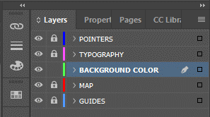
Organise the work well; remember to work on the proper parent page and create layers for each process step.


Add a few new colour swatches, and follow each of the CMYK colour schemes above.
Step 2

Creating rectangles, place them on the left side on the top and bottom position of the first page.
Stretch the rectangle until it touches the bleed margin.
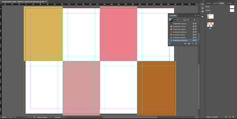
On the second page, place different rectangle colours forming a chequer-style pattern.
Step 3


On the front page, draw another rectangle that goes in the centre of each previously drawn rectangle, add a Thick-Thick stroke style, and fill it with a different colour.
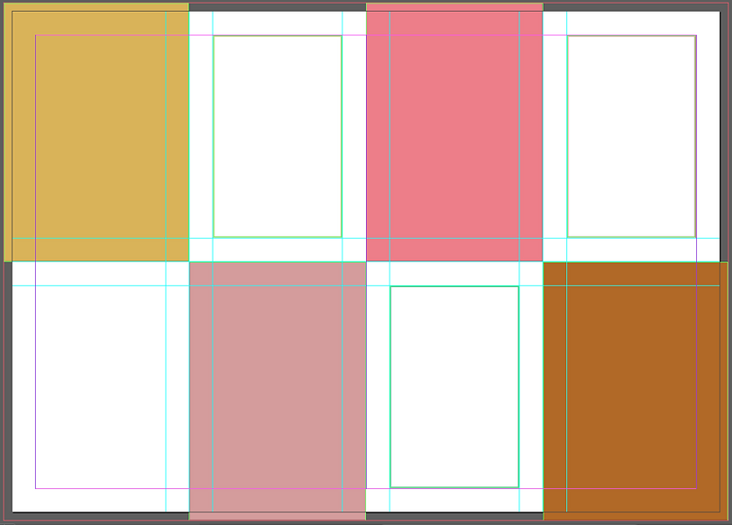

Do the same here, but now place those rectangles in the blank part and also fill the rectangle with none.

Fill the background of the front page with the blue from the colour swatch, and also place a rectangle in the middle of that open space.
Place the map of the city in the middle of the new rectangle.
Step 4


Let’s create the pointer for our city map.
Draw a path using the Pen Tool (P) like the top of a triangle shape. Adjust it to match the ellipse border, and then select all the objects and go to Objects > Path > Join.

Add a shaded effect, select the pointer, go to Effects > Drop Shadow, and follow the values in the image for this effect.

Place the pointers all around the city and change the colours of some of them.
Step 5


Follow the text placed in the centre of the rectangles. Add the name and a few options for the city guide.
Place a text on the back part of the city guide as shown, and use the pointers now in white to accommodate the numbers for each attraction that will be shown on the map.


Do the same for each coloured rectangle, and with the white one add a ‘’Insider Tip’’. I placed a Placeholder text just to idealize the utilization of the space.


Go back to the map’s pointers and number them accordingly with the name of each attraction.
I also changed the pointer’s colours to match each rectangle's colours that carry the pointer's location's name.
Final Design


Week Reflection
This week’s exercise is very detailed, with loads of different features to work with. I applied many techniques and understood the bases for designing a Fold out style. This technique can be used to create a promotional leaflet for many different occasions, museums, expositions, city guides, festive fairs and plenty of other advertisements.
The content learned with this exercise is of great value.
I found no major challenges other than properly creating a good shape pointer, the method for that is simple, but I wonder if there is a simpler way. I think if it were done in Illustrator, it could be easier to get a better pointer shape than what I got in InDesign due to its limitations.
For me having the city guide done was a successful task in general because of the methods learned and the understanding of how it is done and where this method can be applied.