
WEEK 1
Exploring InDesign
ROMEO AND JULIET
This week’s exercise is about exploring Adobe InDesign.
The program is used for a wide range of design areas but is very well-specialized for building editorials, magazines layout, book composition, cover pages, prints, digital publications and many more.
For this term, we are working on two different projects related to InDesign, one is about redesigning a book cover for a classic book, and the other is about creating an editorial magazine style for a typography designer. This is just an example of what this application can be used for.

Setting up a document can be complex but will definitely facilitate your work during the process.
Start clicking in Files > New > Document.
This is a general method and the most common.
The measurements will depend on your needs, but magazine layouts, for example, usually are settled with Width = 213mm and Height = 276.5mm.
Note that I changed the units for Millimetres. The standard for InDesign is Picas.
The number of Columns will vary with the design you want to compose. In the next slides, I will present the different sets of grids that can facilitate each work style.


Margins will guide the central area of the page
Bleed is a line that will guide the images to go out of the page, helping not to let any white border appear between your image and the border of the page
Slugs will accommodate the information the printer needs to know about the document
Lock and Unlock to make all settings the same

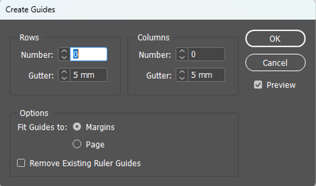
We can adjust the grid style once you set your margins, bleed and slug.
Go to Layout > Create Guides
I like to use a Modular grid for most of my work. It gives me more freedom to spread the elements of the composition the way I want.
This is what is look like when settled.


Quick guides for images. InDesign allows you to adjust and trim your image quickly. Keep in mind that with one click on the image. The borders will allow you to trim the picture; with a double click on the image, it will allow a secondary border where you can adjust the dimension of the image. Those two borders work along for better positioning in the composition.
Want to see the images in full resolution?! Right-click> Display Performance > High-Quality Display.
Movie Poster Exercise


Using the Rectangle Frame tool (F), create a rectangle covering the bleed area, then click File > Place and find the image to be the poster’s background.
Remember the structure well your project. Creating layers for each specific step will help with that.

Select your type layer and insert a text as it is shown. With a property panel change the Tracking size to 940.
Using the Text tool (T), type ‘’The’’ with size 400pt and then go to Object > Effects > Opacity to 60%.
Using the Text tool (T), type ‘’Search’’, but now the size is 220pt and the Tracking at 800.


To export your work, go to File > Export.
In the General step, choose high quality. For compression, make sure to have everything at 300 dpi for better print quality, and for Marks and Bleeds, your printer will mostly care about the crop marks, but there is no problem to adding all of the info if you want to.

Coffee Shop Leaflet Extra Exercise

For this exercise, I tried to create my own leaflet. I added a rectangle shape in the background and added a gradient colour swatch.
I generated a text box and spread it, giving it some hierarchy from title to subtitles and body text.
I settled the body text to relate to something from a coffee shop and then placed an image into a rectangle frame tool (F).


Adjust the image, add a few circles, and reduce the opacity of it to play with the background design.
Final Design. I wanted to try something different, not exactly the same design as the tutor was giving, and so this is what I did.


Week Reflection
InDesign is another great program and an essential one for designers. I am glad to learn the features of this application because that will be worthy.
But as it is a bit different and less friendly than Photoshop and Illustrator, I found getting used to the basic tools challenging. I struggled to understand how the image borders work and how to use them, but when I finally got it, it made sense, so it became easier to manipulate images in the composition.
I found success in setting up the grids, this is not difficult, and the range of grids can be settled the way I need.