
WEEK 1
Motion within a brand
ROMEO AND JULIET
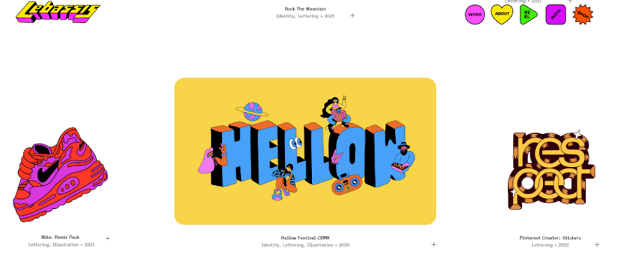
Lebassis’s website is great for discovering and getting inspired by motion design. He loves to use strong colours and approach important socio-cultural topics. Most of his illustration has motions on them. His website is a whole experience, different from the basic ones. His work caught my interest. Most of his work seems to be typeface motions, but he is also definitely into illustration too. Some of his ideas will serve as a source of inspiration.
Website: https://lebassis.com/
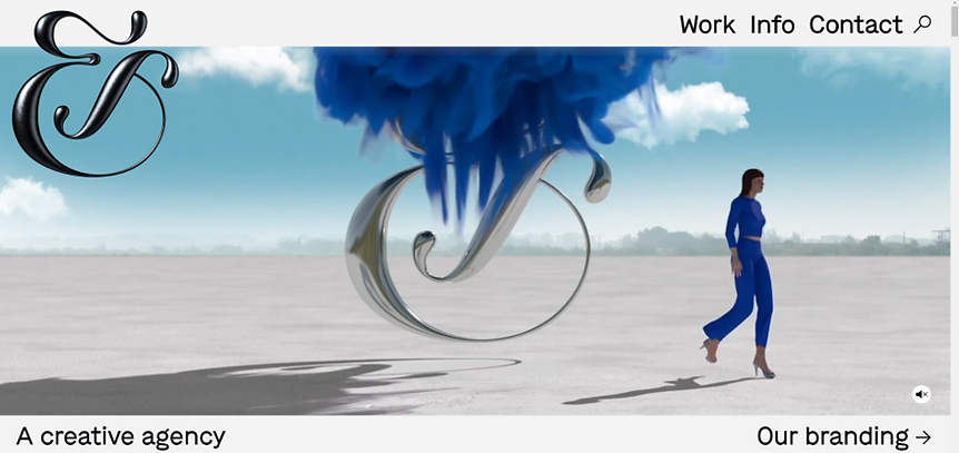
Jessica Walsh is probably one of the most famous Graphic designers in the world. Her work is truly unique, and her website is very inspiring. I found it cool how the idea was to put motions around her logo with the idea that the logo is being forged or discovered. The motions applied to seem quite complex to develop, and we can see how specialised a brand can be.
Website: https://andwalsh.com/
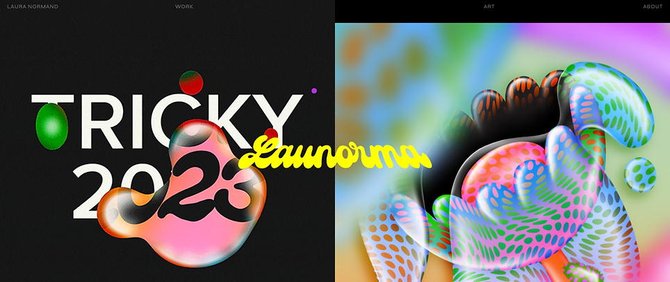
Launorma is one of the first artists I knew when I started studying Graphic Design. She has those kinds of water-style movements that can also be associated with a living jelly, which goes around her typeface and photographs. It is very mystical and abstract. Her motions usually are that jelly going around her typeface and revealing a different message as you see through it.
Website: https://launorma.com/
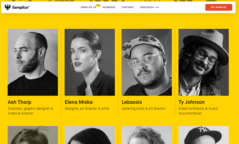
I also want to include as part of my research the Semplice website. This is a company which develops Graphic Design materials, learning methods, development of portfolios and almost every single thing about that profession. I got the chance to find out many interesting websites of great artists through them. It is also a source of inspiration and great to have a few tips about any area in design.
Website: https://www.semplice.com/
Elements and graphics with motion applied
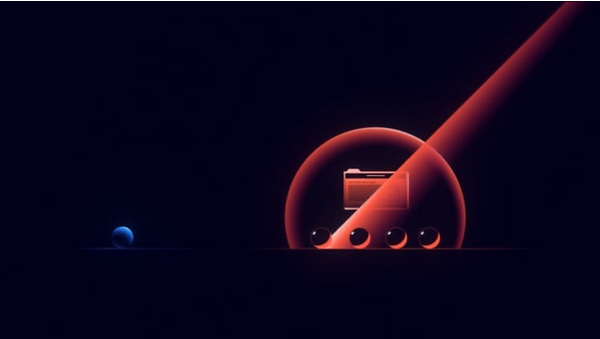
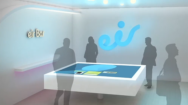
We were asked to watch advertisement videos of brands and cite elements that have motion applied. I selected Ideamarket and Eir videos.
- Both videos show elements navigating through the screens. Those elements are essential to explain how the brand works or its purpose.
- I like how Ideamarket shows a small ball in the company's colours going around just as if someone from the company would do if they want to show you the company's services, just like people show the companies areas for a new joiner, for example. So the ball goes through the process that the Ideamarket service offers, and without saying a word, you can easily understand the purpose of the video.
- Eir video shows much representativity of being in Ireland. It is nice how their fluid logo can behave because of its fluidity lines and relation with the air. This is an excellent feature for the brand because they can create that relationship and do it.
Great motion applied:
- Ideamarket with the listing becoming organised by itself, priorities were put on the top showing the efficiency their service can offer.
- Eir uses the fluidity of its logo and plays around with many mockups. Those mockups interact with the logo bringing a few nice motions.
Analysing website with motions
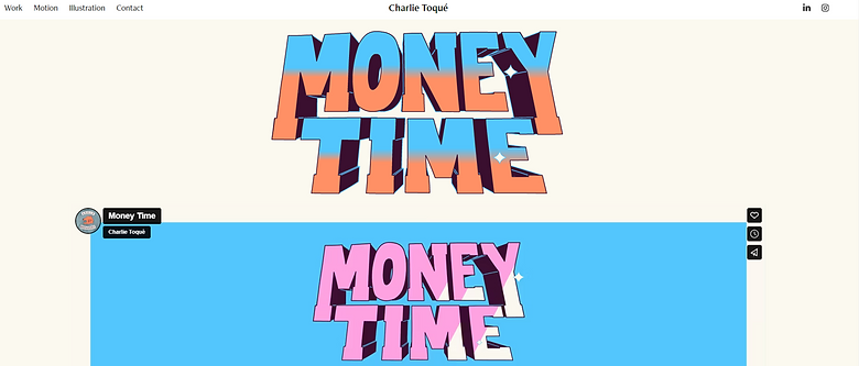
For that exercise, I chose Charlie Toque and the Reddog website. Both sites have cool motion features, they usually are simple, but they manage to deliver the message. Charlie is specialized in motion and animation, and I found his work inspiring. However, it goes towards illustration rather than Reddog, which works more with photographs and typography.
- Reddog animated their logo. It is pretty subtle. You can see the dog blinking and his ear going down. It is interesting because instantly, you instantly connect with the brand logo, just as if they were welcoming you to their site.
- Another cool feature is that Reddog has gifs to show a small fraction of their work while you are navigating through their landing page. It is good because you can see everything they have done without clicking.
- Charlie's website shows his excellent animated illustration. I like the way he shows the steps of his work. He also animated titles of his work, and it seems to add great value to his drawings.
Websites:
Week Reflection
This week I have been introduced to Graphic Motion. I found interesting the way that I learned to look for graphics from now on because when navigating on a website with motion features, you feel welcome, and it seems that everything connects to you in an easier way to digest the message.
It is clear that motions in graphic design play an essential role, and also it demonstrates the abilities that the brand can offer, just like putting your work to the next level.