
WEEK 5
Text Animation
I will experiment with text effects that can be used for a brand promotion very simply. Those effects are subtle but enhance the message to be conveyed. I hid my text behind an invisible rectangle so it could appear sliding into the screen.
I begin creating a simple square where it will be my canvas for this project, I chose the colours that refer to my brand identity.
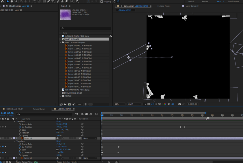
Here I added all the types in different layers. Each type I wanted to animate is a different one.


As shown in the layers panel, I drew a rectangle for each of the text layers, making sure each rectangle was above my layer. After that, go to the column "Track Mate" and select my text under the rectangle instead of the option "none" I chose the name of the rectangle layers that is above it. That made the rectangle invisible, but it is still there so I can hide my text behind it.

After that, I just defined a position anchor point to start my effect, then I dragged all the text layers selected to the bottom of the screen (behind the rectangle) and defined my final position anchor point.
With that, when pressing play, the text will slide into the screen. I only positioned each anchor point accordingly to the timing that I wanted the text to appear.


Hoover the mouse over the image below to initiate the resulting video of this animation.

Reviewing Research
With the research done so far, I have been able to:
- Learn and discover about designers in all areas, especially motion graphics. Understand how they work and how they represent their brand through their media.
- Evaluate the importance of graphic motion for a brand, understanding how those techniques can be essential to communicate a message.
- How to analyse my competitors and rate how they promote their idea, theme and message.
- Find out that a logo, even with a simple motion, can approximate the brand to their customers or people navigating their website, creating a connection with it.
- Analyse my brand identity and compare it with my research to improve and enhance it through my collected knowledge.
- Became creative when developing ideas for the promotion of the brand.
- Experiment and discover tools, features and effects in Adobe After Effects. Researching channels online where I could develop that skills even further.
- How to write a script and develop a more professional-looking storyboard.
- Learn how to enhance my text message through simple effects.
So I believe that my research has brought me good knowledge and made me aware of abilities and skills that I did not have before. Apart from all the skills, I found a great and inspiring website that I will always use as a reference, and I will discover YouTube channels that teach techniques to improve After Effects abilities.
Developing my logo motion design

I started importing the illustrator files, in which I put everything I wanted to animate in different layers, such as each of the bones and the orange background.
For this next step, I want to make an animation as if the bones had fallen apart and are coming together to create the logo's shape. For that, I used simple features: changing the Position and the Rotation of each part of the logo.
I defined an anchor point and then dragged then out of the image space, so I created another endpoint further in the animation line, which would be the moment the animation stops.
Spreading
Coming Together


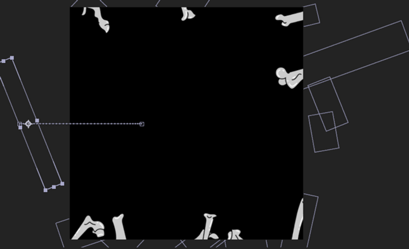
This is what the animation looks like in the beginning, with all the part spread over the screen, which will come together when the animation start.
Note that I applied the same motion for every part of the logo, only changing rotation and position values to develop a more organic idea. Only rotation and position were changed here.

After animating the bones, I wanted to create some effect on the background that could keep the mysterious and creepy feeling, so I added the "Fratical Noise" effect, which simulates smoke.
Before selecting the effect, I added a purple background with the rectangle tool and put it on the bottom of my layers panel. I had to add this filled rectangle because I realised that on Illustrator, I saved my layers without a background, so when I applied an effect like the smoke one, it was not showing because it needed a layer to be supported.


The smoke I decided to put represents the same smoke I drew for the brand's poster. As you can see, purple smoke is going around in the background, but as this illustration is a static image, the representation of it is more cartoonish.
I found that a cool feature for my animation because I could represent that with a real version of smoke.
In that step, I directed the smoke to be blown. For that, I clicked in the ''Offset Turbulence'' holding ''ALT'', then a box will pop up in the timeline for you to put the effect values. At first, seems complex, but the important information here is the numbers. If you change the numbers and press play, you can see that the smoke will change directions and pace. I just picked one that would suit my animation and that is not too fast or too slow.
I also changed the Fractal Type and Noise Type, so the smoke would have softer curves. Another thing is that I turned off the ''Invert'', with that the black shadow in the smoke turned white and the light part of it, did the opposite.


The images above will show the positioning of the smoke, as you can see I used the same smoke effect but now I brought it to the front, so it would nicely interact with my other elements.
What I did was create masks for the smoke effect. Once I created it, I reduced the opacity so the smoke would not be too edgy. After that, I duplicated the same smoke effect four times and put it all around the centre of the animation.
That centre space will serve to position the logo.
The video that helped me develop that skill:
Create an Atmospheric Smoke Effect in Adobe After Effects - Envato Tuts+


Hoover the mouse over the screen below to play the animation result.

Week Reflection
That week was for a great improvement of the brand look. Text animation can be applied in many different contexts. I aim now to learn different methods to keep improving it.
The logo motion aims to develop a good sense of the brand message. It is aimed to be used in social media posts and brand promotion on other online platforms. I tend to remove the background of that animation to use this motion in different scenarios, for example, in the corner of the website page.